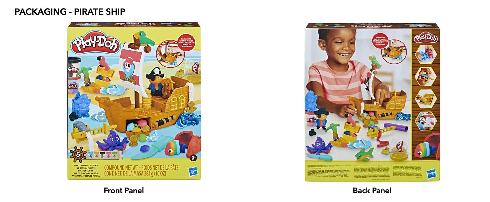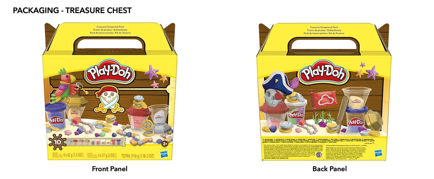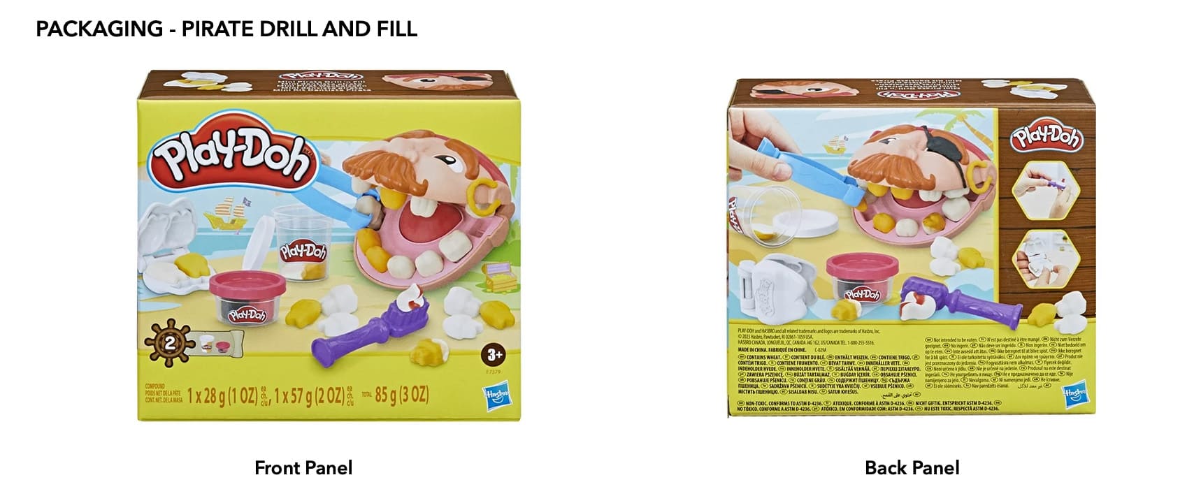
Looking to push the boundaries of the Play-Doh brand and working alongside a team of creative individuals. The lead designer and I collaborated on how to take the Play-Doh brand and give it a theme. Most Play-Doh packaging consists of the iconic yellow however for this one we chose a new approach.
Utilizing the yellow I experimented with brown similar to wood paneling of a pirate ship or treasure chest. This helped keep to the pirate theme while at the same time adding a new element that help stood apart from other Play-Doh projects on shelf.
We also were allowed the opportunity to play with different types of callouts as normally the callout is circular. In this case we chose to utilize a ship steering wheel to tie back to the theme while at the same time giving a shakeup from routine assets used in prior packaging.