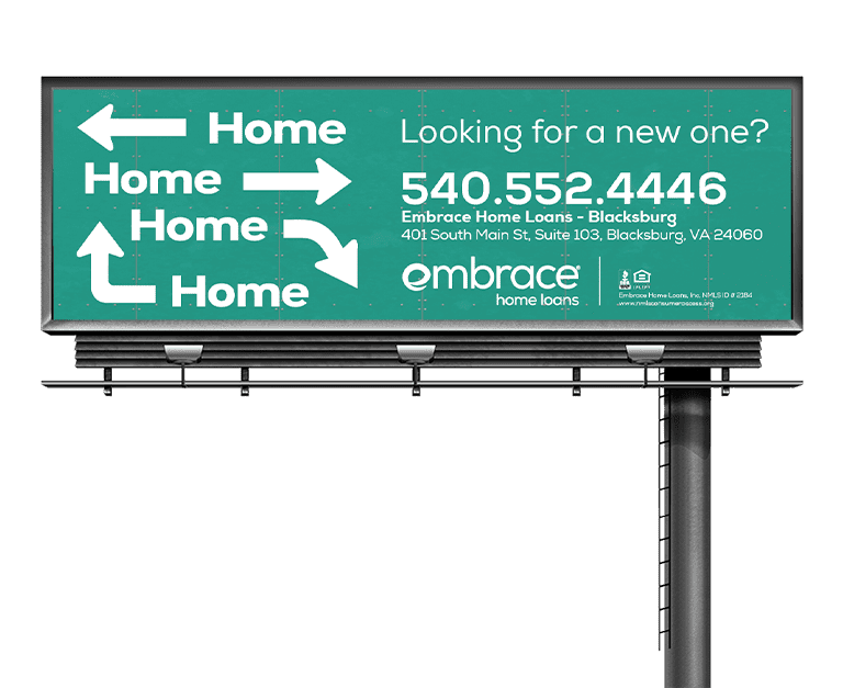
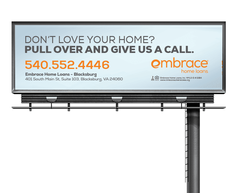
Looking to rework their billboard campaign, the Blacksburg branch at Embrace Home Loans requested new billboard designs. For this project I examined the previous campaign to discover the designs were very text heavy that made it hard to read in a short time frame. Simplifying the copy to be more readable, I kept just basic information to reach the branch and a headline. That way it was easier to absorb the message.
Two designs were developed with one being simplistic and the other more creative. The first design incorporated gradients to stand out with a headline of contrast color to catch peoples attention. Working with the copywriter the headline also serves as a call to action to make people react immediately. The second option played off a direction sign to indicate any exit could be home once you worked with Embrace.


